Consumer Banking Application Redesign
Optimizing the user experience for new customers opening a personal bank account through a branded mobile-focus redesign, leading to a 33% increase in applications submitted in under 10 minutes.
Lead UX Designer
Web & Mobile Experience
Consumer Banking
3 Months
Overview
Optimizing the account opening process for a better mobile experience.
One of my first major projects at Bank of Internet (BofI), now Axos Bank, was to look into the consumer bank account opening process for new users and find opportunities to simplify the mobile experience. The redesign focused on splitting pages into smaller segments to reduce cognitive load, reviewing fields and UI elements to remove unnecessary items, and updating the look and feel to match the BofI brand. These changes led to positive results as users were able to complete the application faster.
Responsibilities
UX analysis, wireframing, visual design, prototyping, quality assurance
Team
1 designer, 1 Business analyst, 1 tech lead, 6 developers, 2 QA engineers
Decision-Making Framework
- Driver: Business Analyst
- Approvers: SVP of Consumer Banking, Chief Marketing Officer
- Contributors: VP of User Experience, VP of Consumer Banking, AVP of Consumer Enrollment
- Informed: Customer service representatives
The Challenge
How might we improve our account opening experience for consumers?
Although the experience was responsive on mobile devices, the account opening experience lacked brand consistency and was not optimized for responsive devices. A lot of users were coming from responsive devices (at that time, data suggested around 52% were coming from a mobile device or tablet) and reducing any unnecessary elements was believed to help users complete their application as fast as possible. With this new mobile redesign, BofI wanted a more digestible account opening experience with a brand consistent design.
Solution Preview
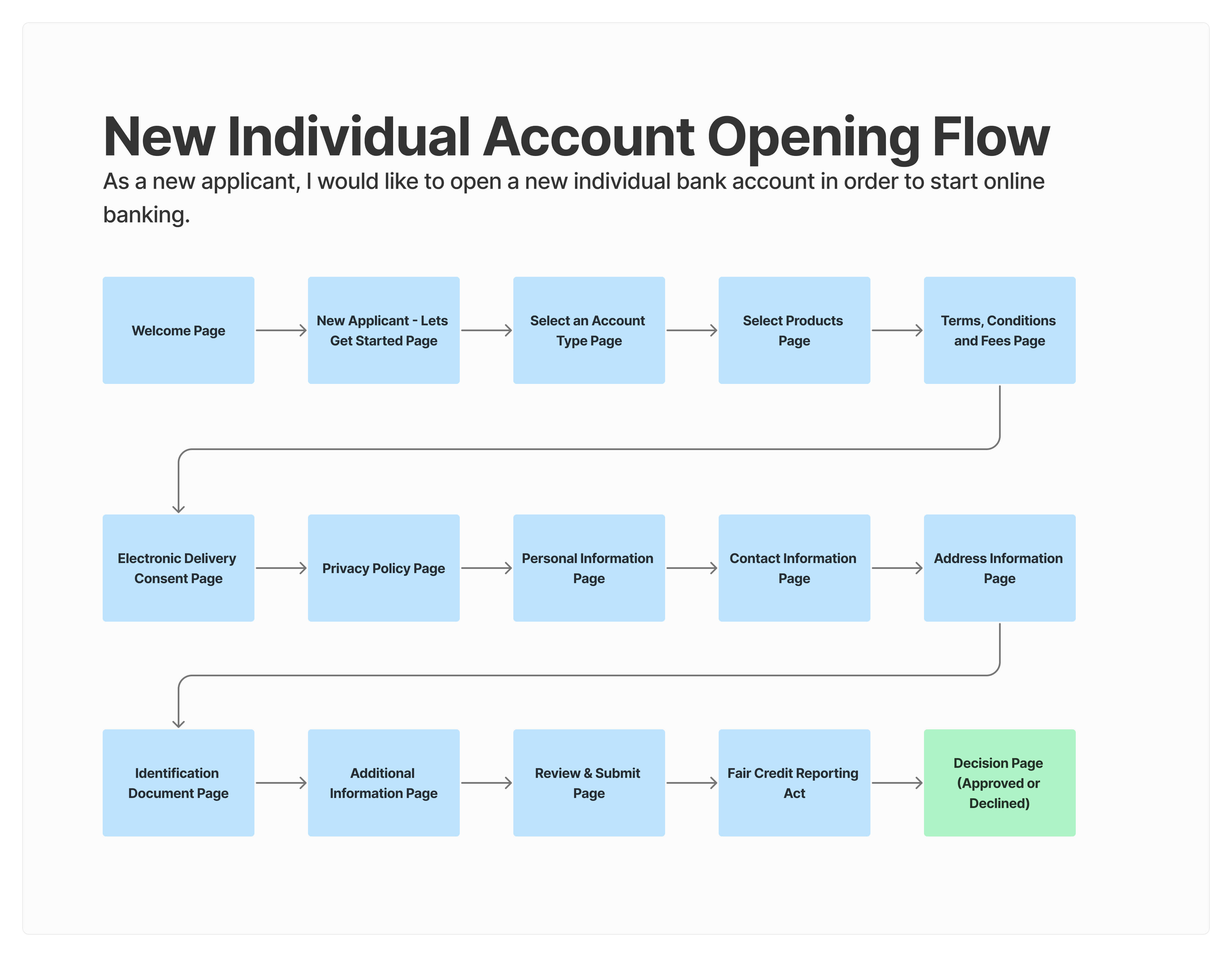
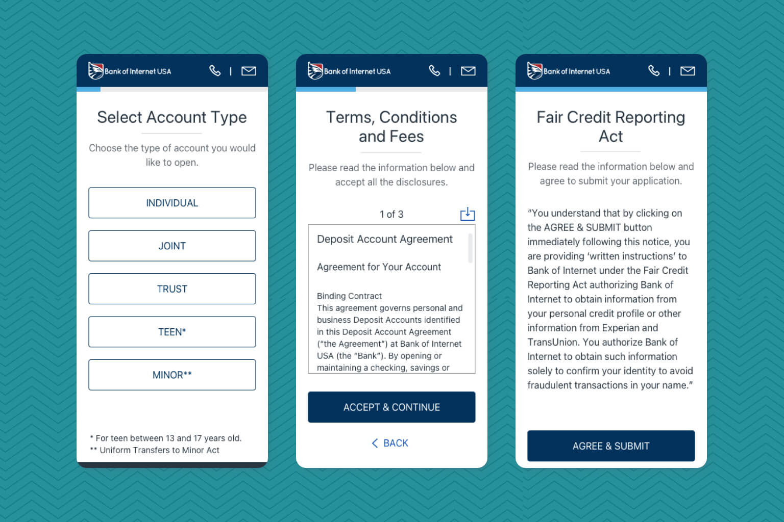
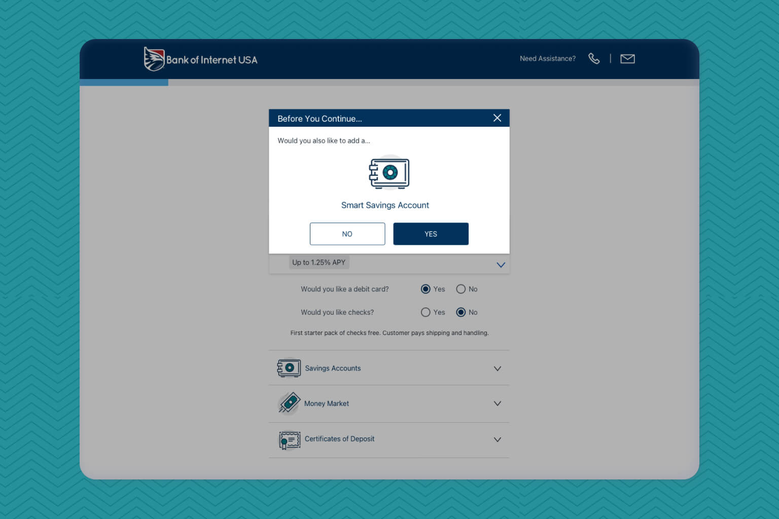
Reducing Cognitive Load (Separation of Pages)
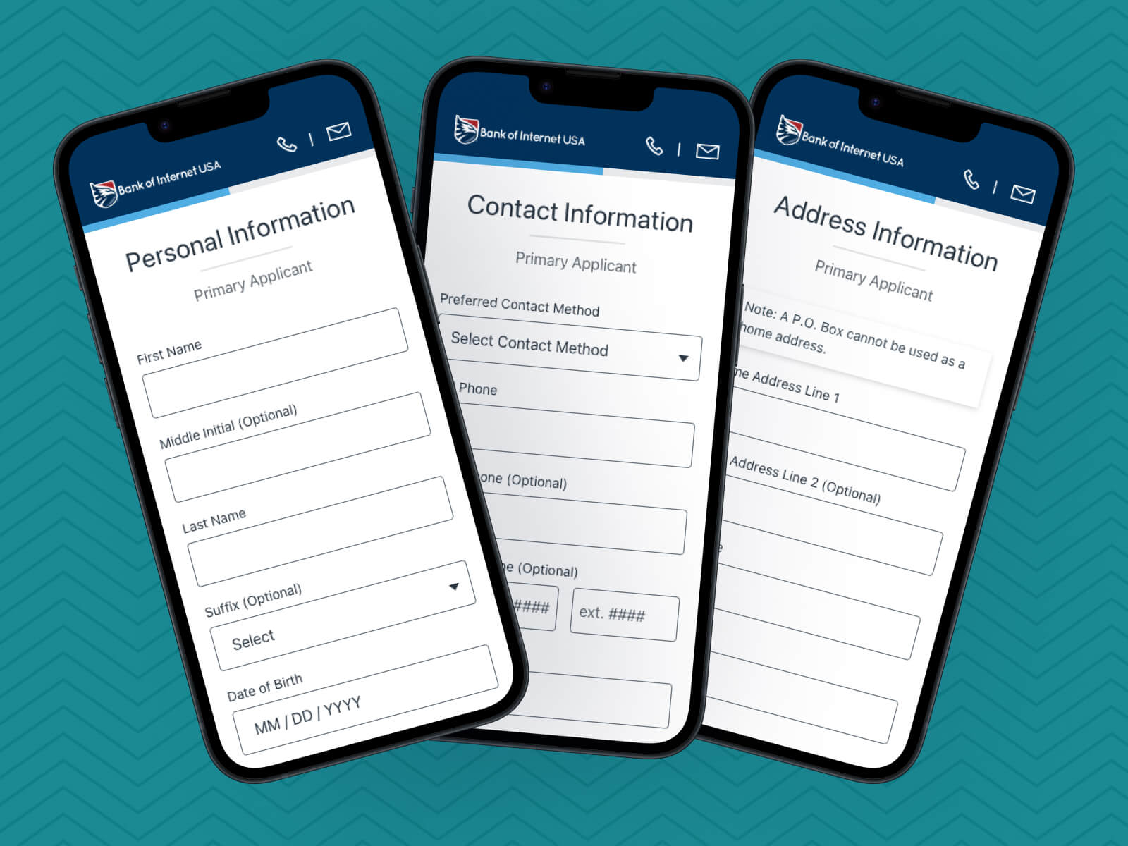
Input fields were separated into multiple pages to create a wizard-like experience. All input fields were also reviewed to determine what could be remove to further simplify the account opening experience.
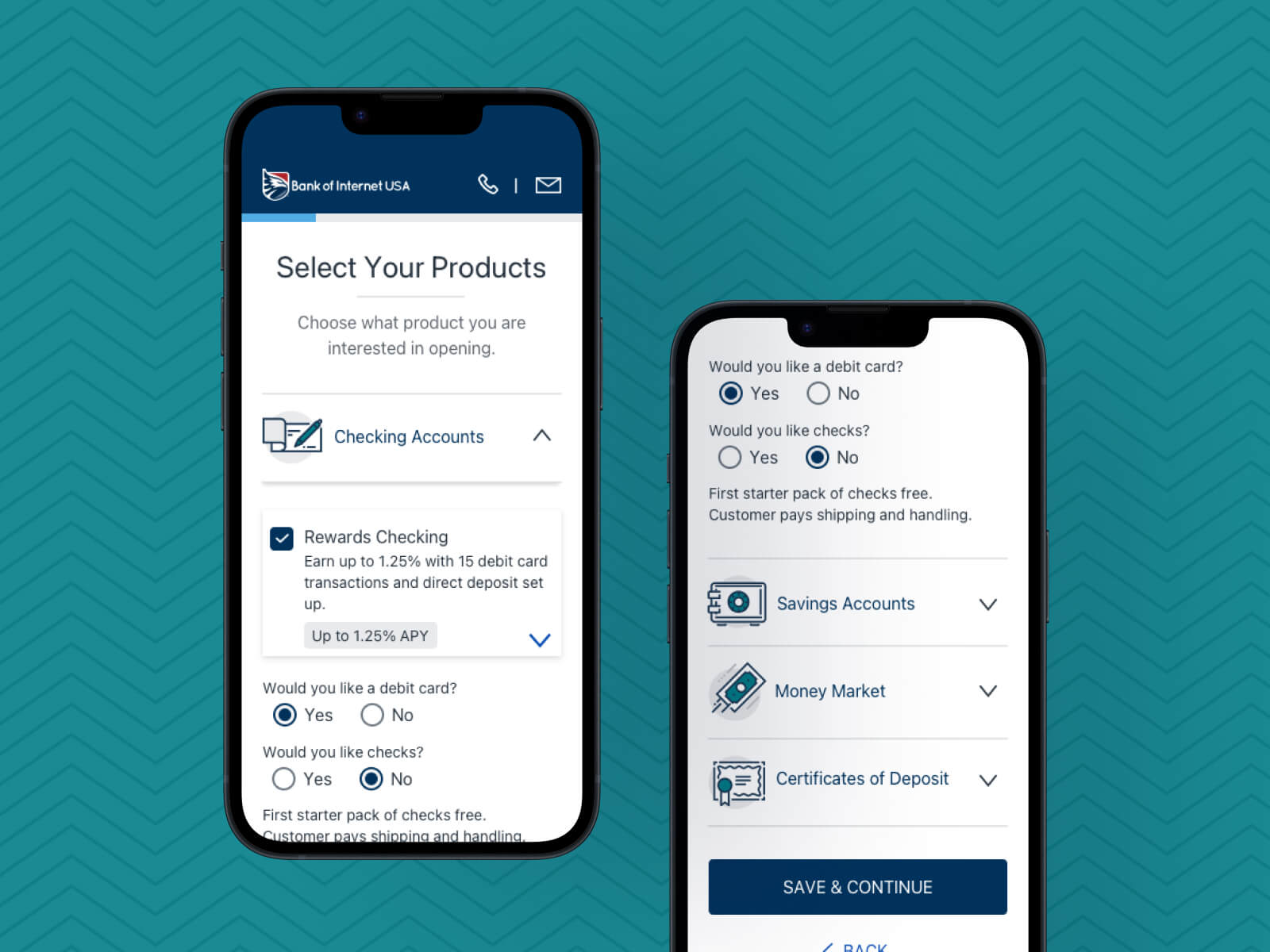
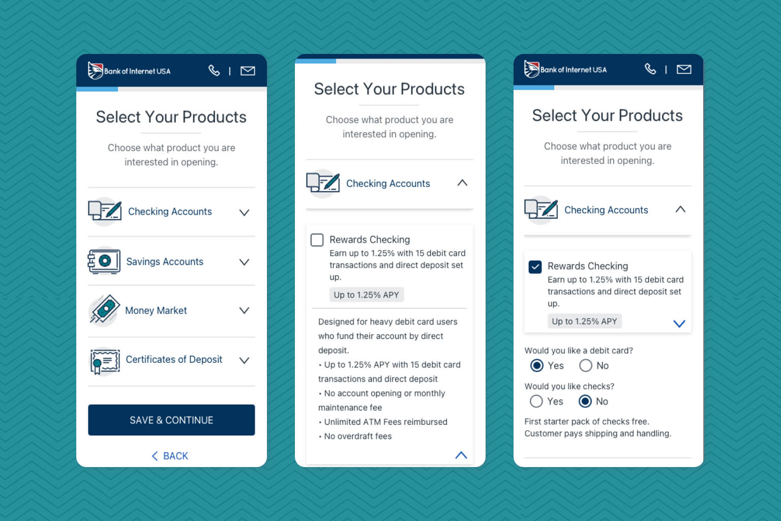
Reorganizing Product Selection
Bank account selection page was restructured and organized in a way for a more optimized mobile experience with a reduction of visual noise as applicants looked through the available accounts they could open.
Creating an up to date brand design
UI elements were redesign to match our latest style guide from the recently release online banking platform. Elements were then updated into the BoFI USA color palette.
Results & Impact
Submission Time Improvement
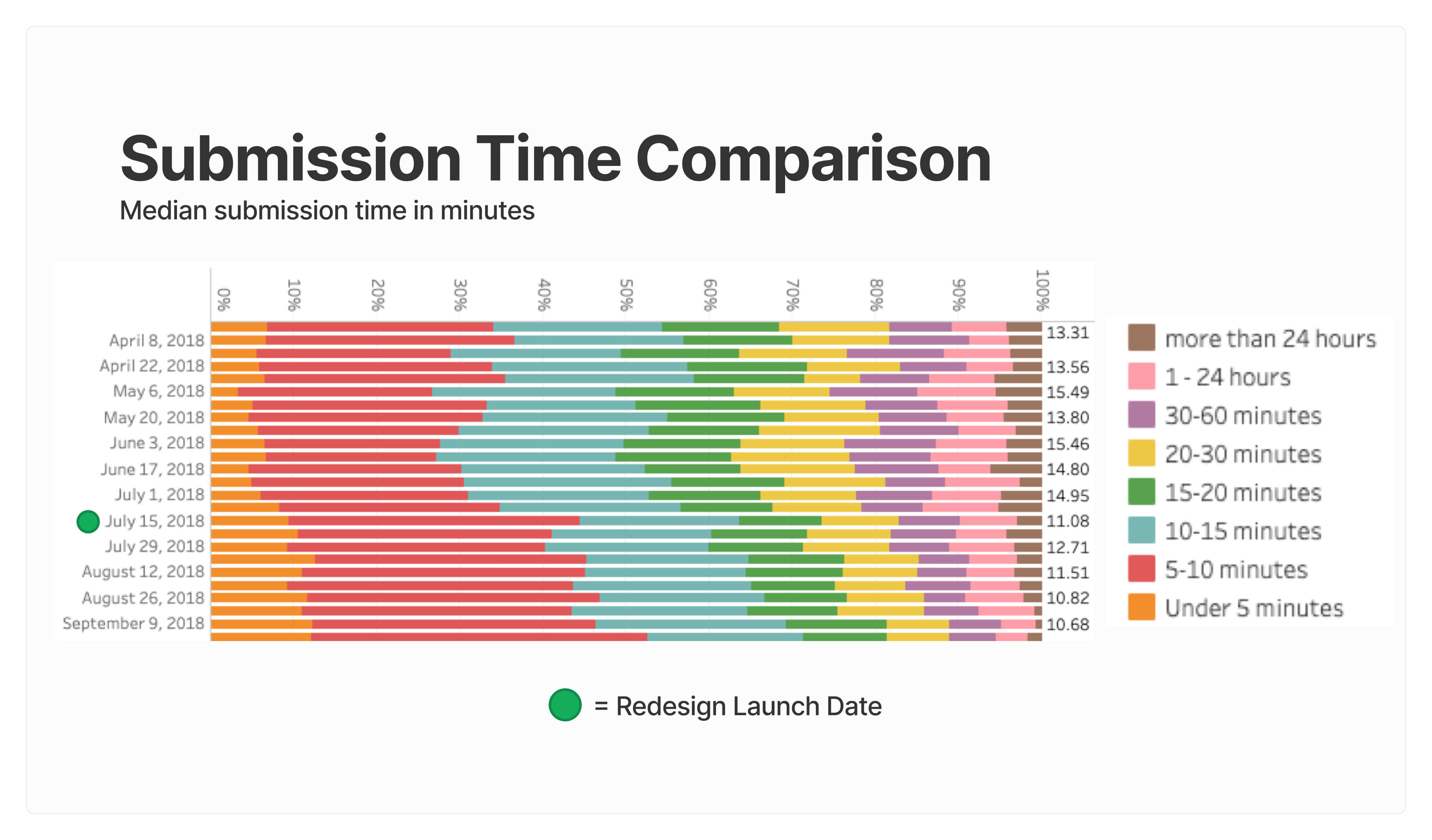
The median submission time decreased from 15 minutes to 11 minutes, enhancing overall user efficiency.
Increased User Engagement
A 33% increase was observed in users completing applications in under 10 minutes, indicating a significant improvement in user engagement and conversion rates.
Brand Unification
Brand consistency was created across the marketing site, the online banking platform, and now the consumer application process, leading to a synthesized experience for thousands of new and existing users.
Background
About Bank of Internet
Bank of Internet, now Axos Bank, is a digital bank that offers a range of financial products and services for consumers and businesses. Such services and products include: bank accounts, investing accounts, loans, and mortgages. Founded in 1999, Axos Bank is among the first digital banks in the world.
Discovery
Identifying Requirements
After the kick-off meeting, the business analyst shared a project discovery document in which priorities and requirements were listed. This was extremely useful as it helped identify scope and break down requirements into design features. The major design features were listed as the following:
- Review questions in the account opening process and determine what is essential.
- Review product selection page and make it a more digestible experience in mobile.
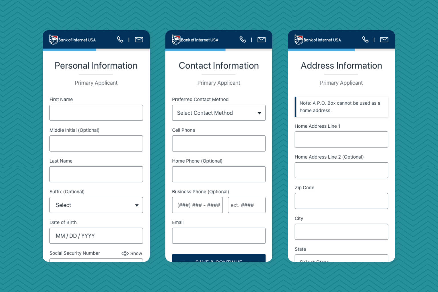
- Review personal information page and separate into smaller pages.
- Update styling to match the current BofI brand, which in this case was BofI USA.
Setting Up Goals
The following goals were identified after discussions with the business analyst.
Business Goals
- Increase application submissions for consumer accounts.
- Decrease application submission time.
- Update interface to create consistency with the current brand guidelines.
User Goals
- Easily access an application from a mobile device.
- Submit an application as frictionless as possible.
- Understand the next steps after being approved for an account.
Scope & Constraints
Project Scope
Priority for this project dramatically increase as stakeholders found the need to be mobile-friendly. Data was already showing an increase of mobile users which Google Analytics show to be around 52% by the time the project was kicked off. Additionally, this initiative was seen as an improvement with high impact on revenue and of course, customer acquisition. This led to multiple feedback meetings early on and became almost daily as I worked on the final details before development started.
Date of Release Constraints
The importance to launch this project was emphasized as it was planned to be launched a few weeks prior to updated online banking platform for BofI USA. This increased the need for more feedback sessions closer to each other, but it also added development resources constraint as some of the team was focused on the other project. Shout out to the business analyst as he helped maintain a balance of design updates and stakeholder requirements and avoid release delays.
Understanding How Things Work
Workflow & Use Cases
During discovery, it became vital to understand the current workflow of opening an account. I sat down with the business analyst for an initial walkthrough and asked for a lower environment access to review the whole process by myself. This allowed me to create my own workflow for reference.
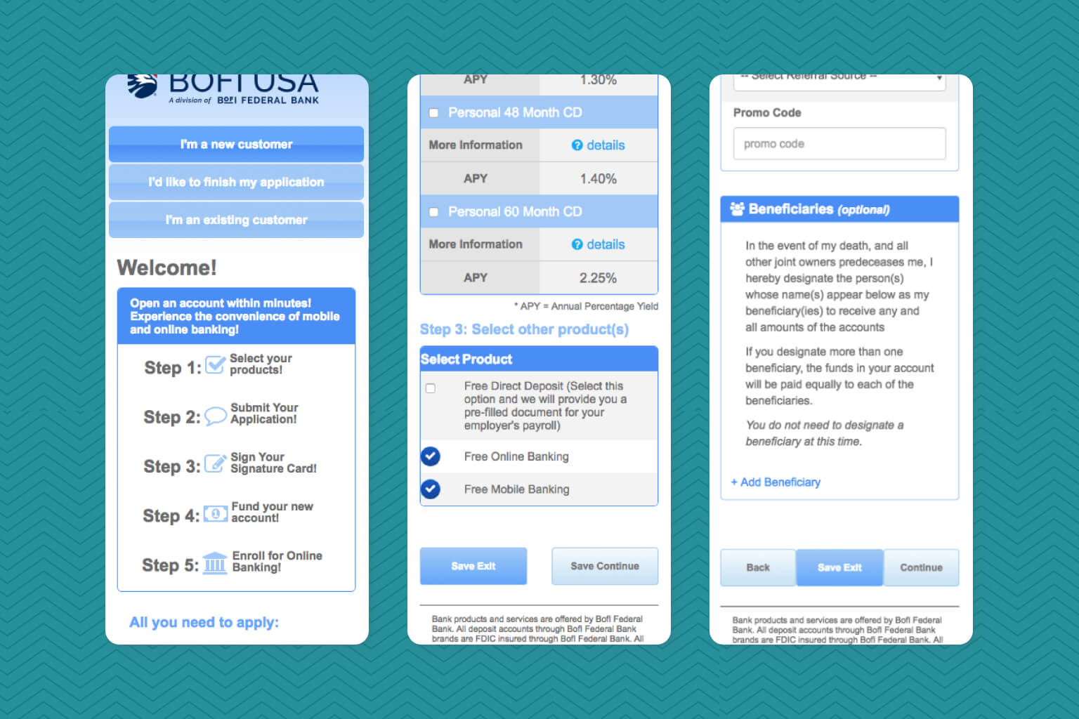
Old Design
It was evident at this point that the UI needed improvement as it had not been updated since its released over 3 years ago. Here are some screenshots of the old interface.
Competitor Analysis
Since the enrollment platform had not been visually updated in years, I did some competitor analysis to learn about current trends as well as find additional opportunities to improve the overall experience while staying within scope.
From this research, I discover some older competitors had longer pages (such as Chase, Bank of America) while newer fintech companies had broken applications into more digestible sections. This aligned with the proposed direction from stakeholders.
Design
Design Principles
Based on the goals and priorities of this project, I focused on these 3 design principles:
Be Mobile Friendly
Create a mobile friendly experience to allow users to apply from their mobile devices. Just because its mobile responsive, it does not mean its mobile friendly.
Be Simple
Create an experience that does not overwhelm users and is easy to understand the task at hand.
Be Up to date
Unify and meet current design standards to provide consistency with the Bank of Internet USA brand.
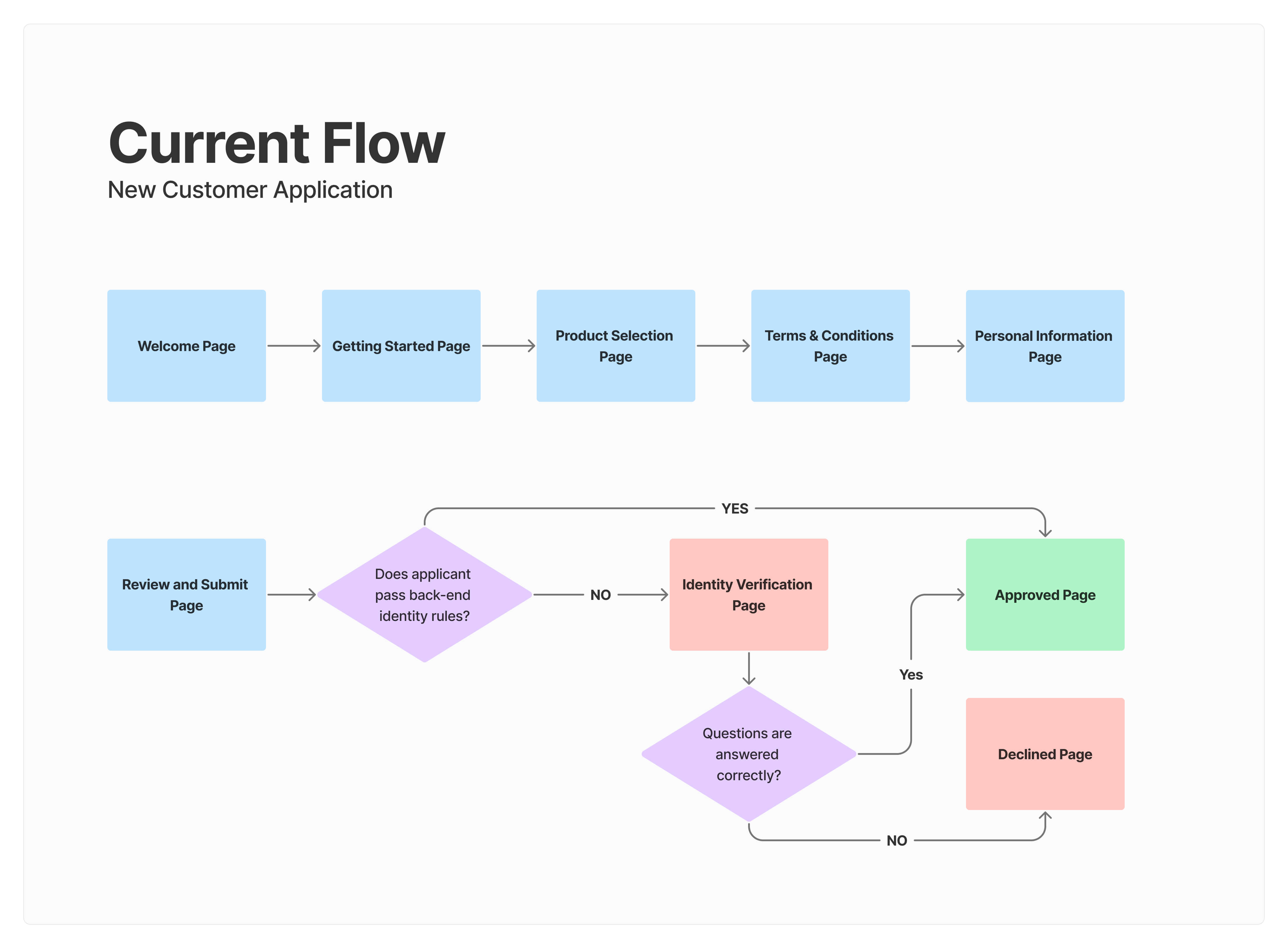
Creating The Happy Path Flow
Identifying Key Solution Elements
The following key solution elements were identified and served as my top priority design checklist:
- Separation & Reduction of Fields
- Starting page
- Product Selection Page
- Updating UI to Current Brand
Feature: Reducing Questions Asked
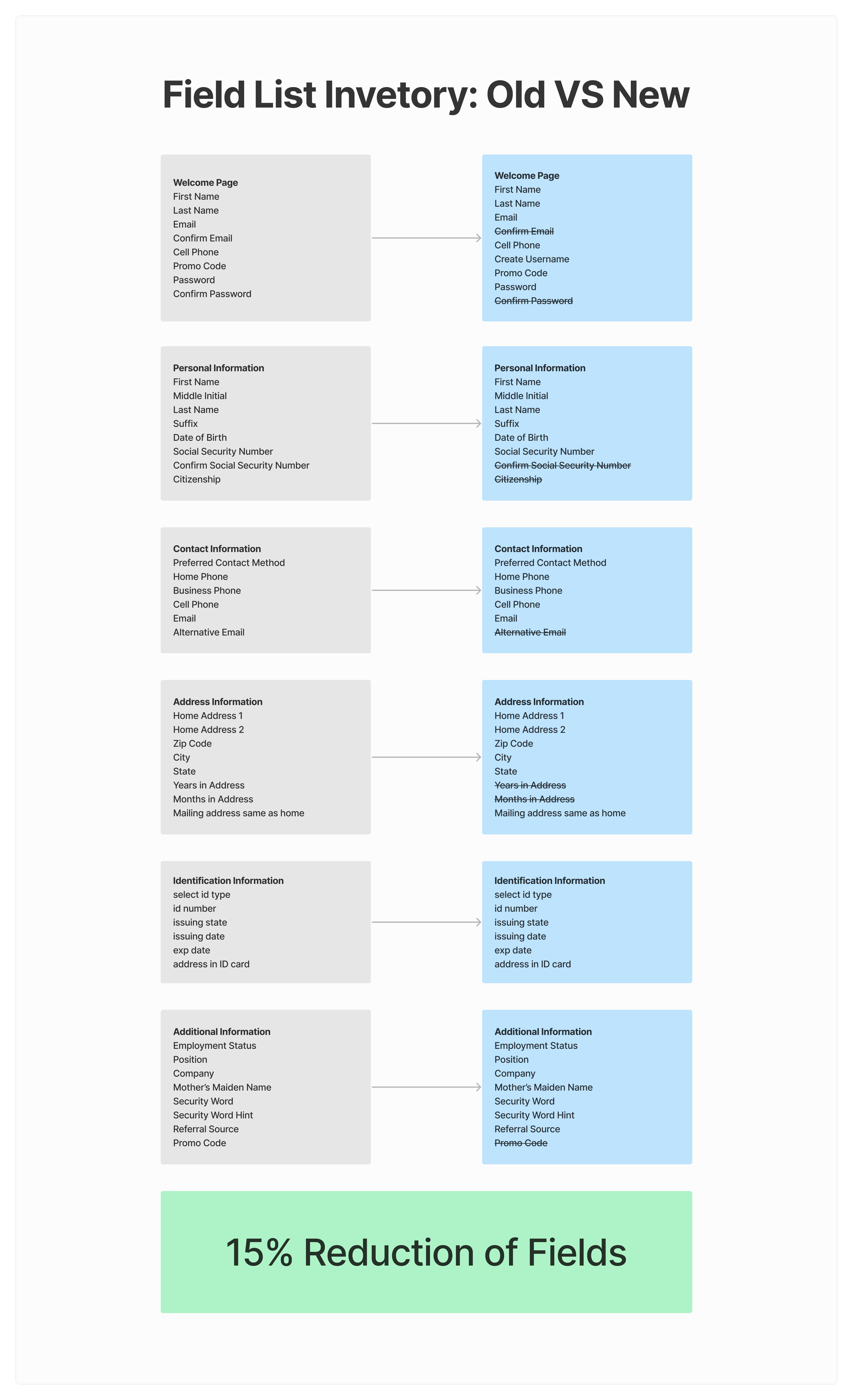
Focus: Reduce field inventory of application to allow for faster application completion.
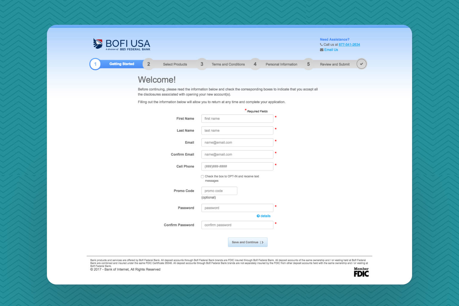
In order to understand how I would be able to simplify the process, I took a list of all the input fields in the application. As some fields were optional, I thought this would be a good opportunity to review them with stakeholders and potentially remove them from the process. This also served as an opportunity to look at require fields and see if they were actually necessary.
Field List Inventory Reduction
The new application flow had a reduction of about 15% of fields. A few optional fields were remove in addition to some fields asking for text entered confirmation.
Feature: UX improvements & Mobile-Friendly Focus
Focus: Separation and simplification of pages to reduce cognitive load and remove distractions.
Removing Sections
To strive for a more simplified experience, sections were reviewed by stakeholders to determine if there was a need for them.
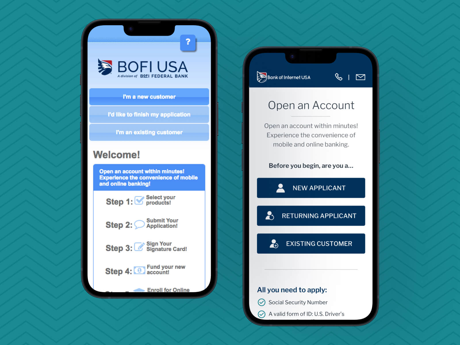
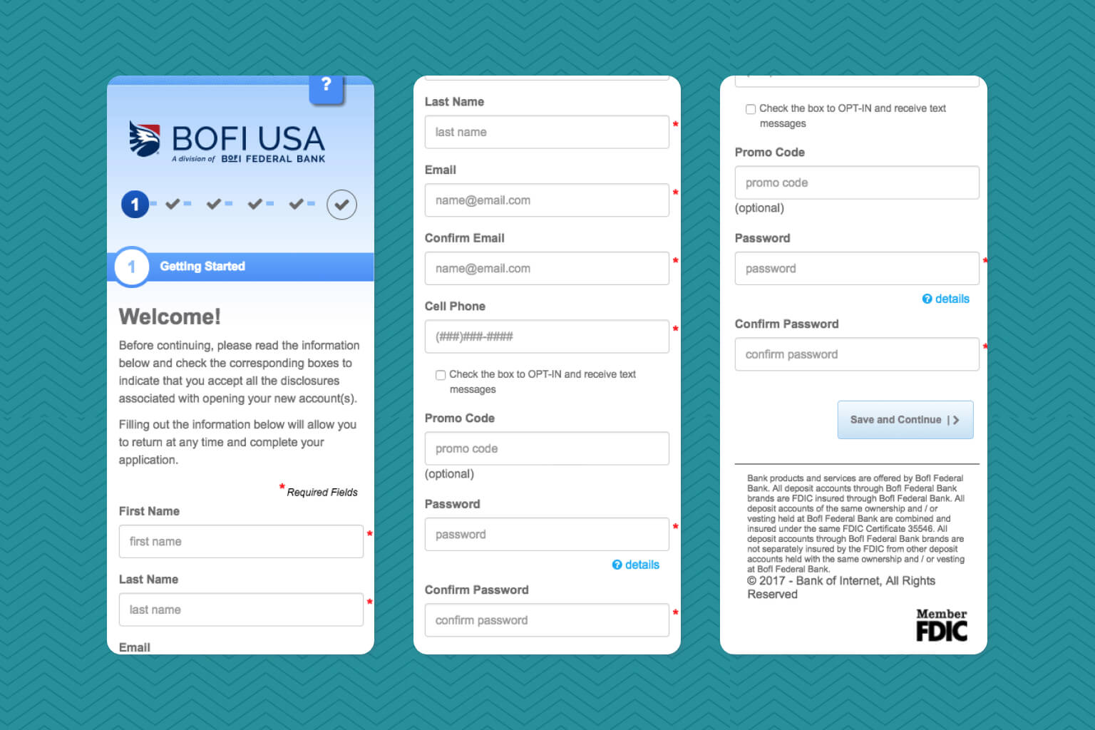
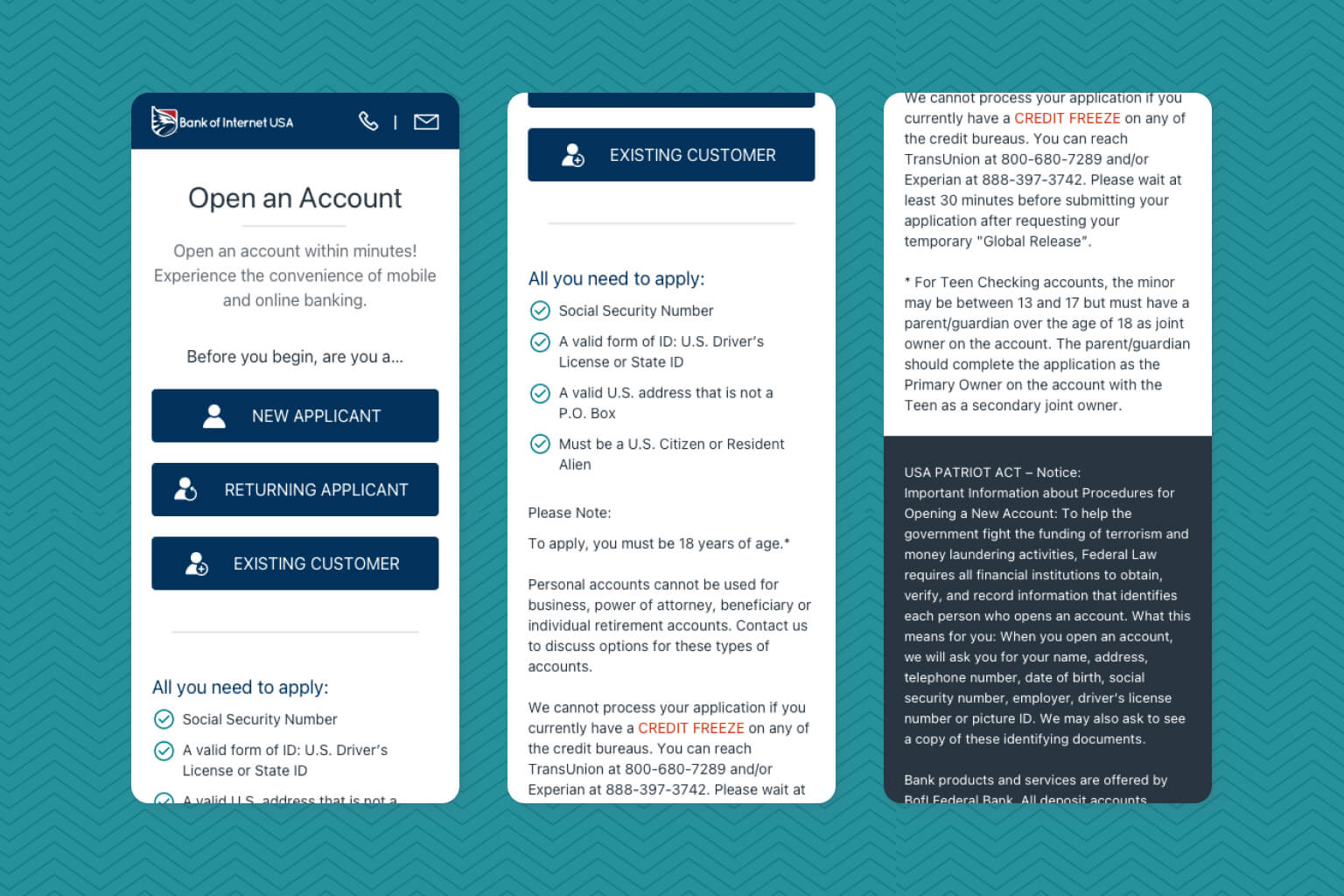
Welcome Page
The welcome page included a step by step guidance section that used a lot of real estate and pushed the "Enroll Now" button way below the mobile device fold. As this section did not provide much vital information, it was removed.
Product Selection Page - Selecting Other Services
The old product selection page included a section where applicants select additional services such as free online banking and free mobile banking. Since having these services are a norm in the banking industry (no one really pays for online and mobile banking), highlighting such services as free was considered redundant and were removed all together.
Information Page - Beneficiaries Section
This section was labeled as an optional section in which applicants had the ability to select beneficiaries. After review, this section was considered unecessary for bank account opening and was decided to move it to online banking, where once approved, they have access to it.
Reducing Cognitive Load
After reviewing mobile data analytics, stakeholders and I believed that separating pages into digestible chunks would push for more submissions. A trend to open accounts in mobile devices was visible and by separating the application process, we also believed that users would focus on smaller tasks to give them the impression of faster progress.
Starting page
Updated the starting page to focus on identifying who is the user and removed unnecessary information.
Product Selection update
One of the biggest pain points discovered was the extremely long products page with the usage of repetitive elements.
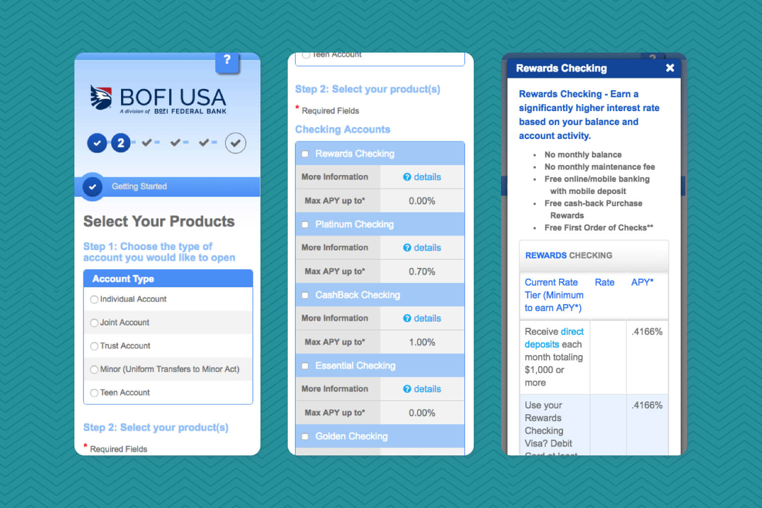
With this updated design, the focus was to hide products in their respective category (checking, savings, etc) in order to allow applicants to view all product type options. Once they clicked on a product type, they would view individual accounts and their benefits.
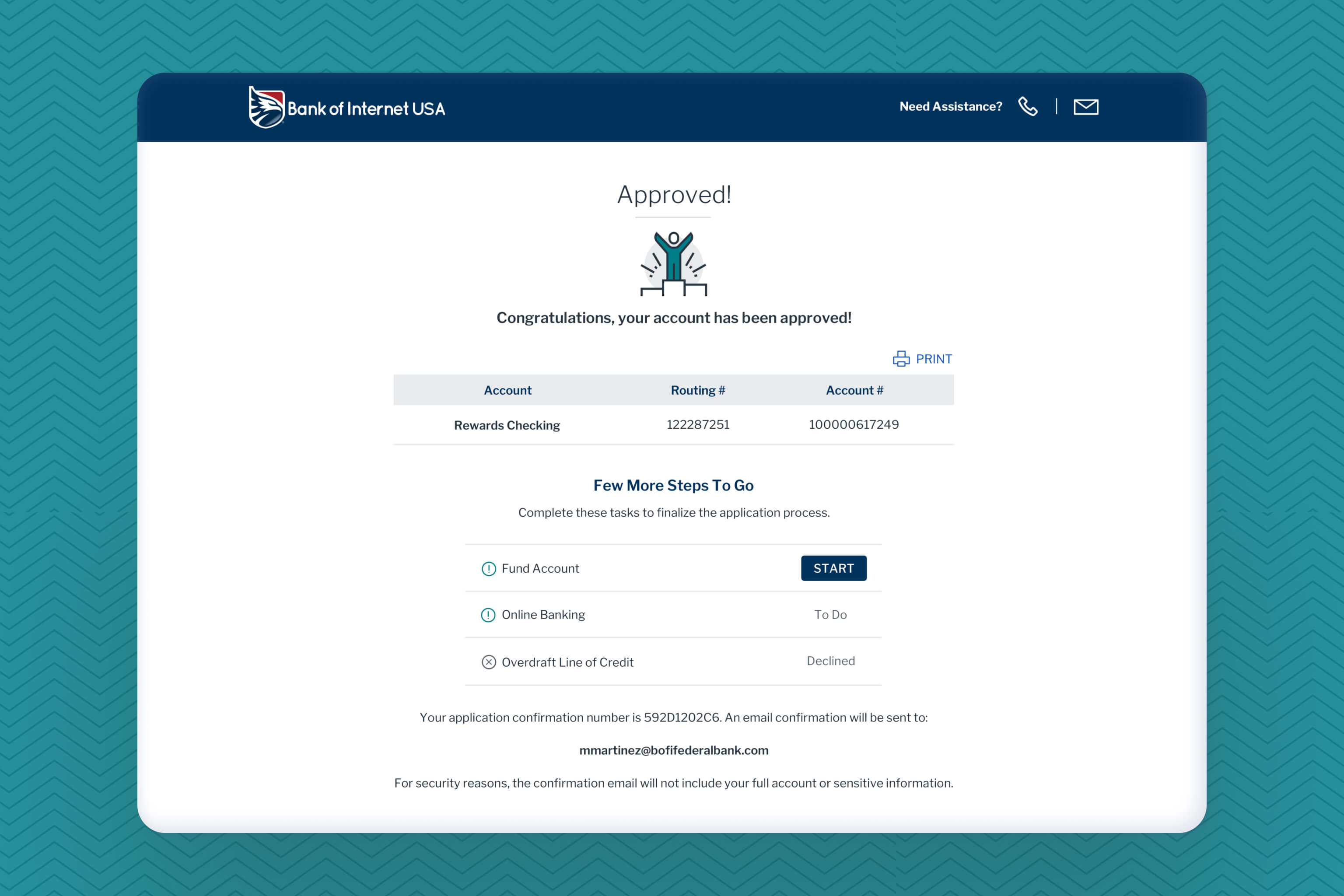
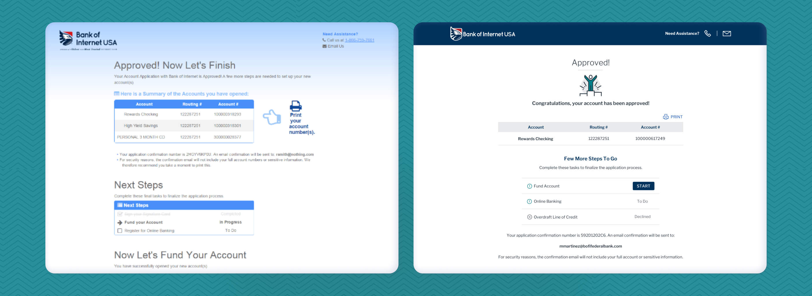
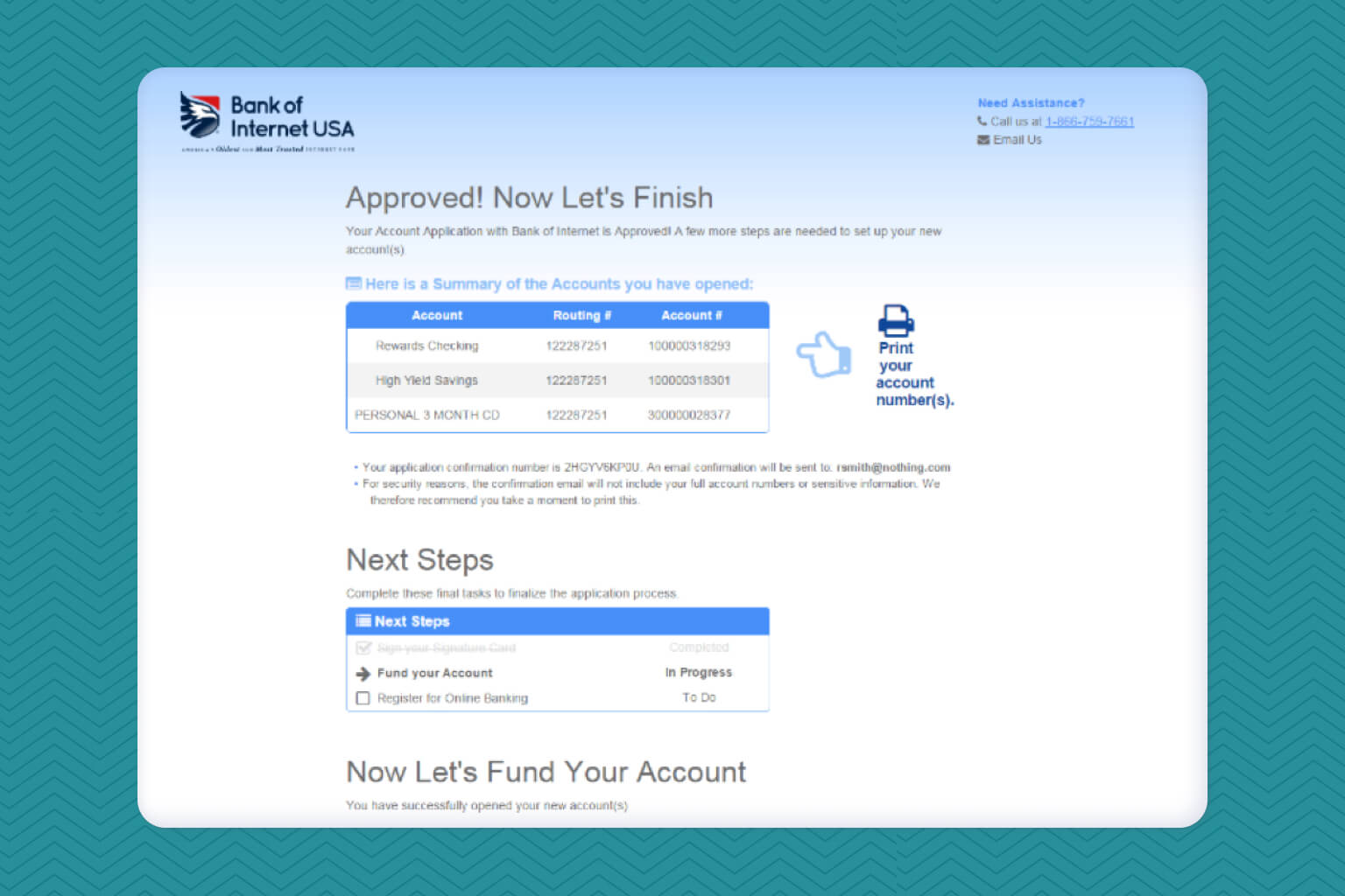
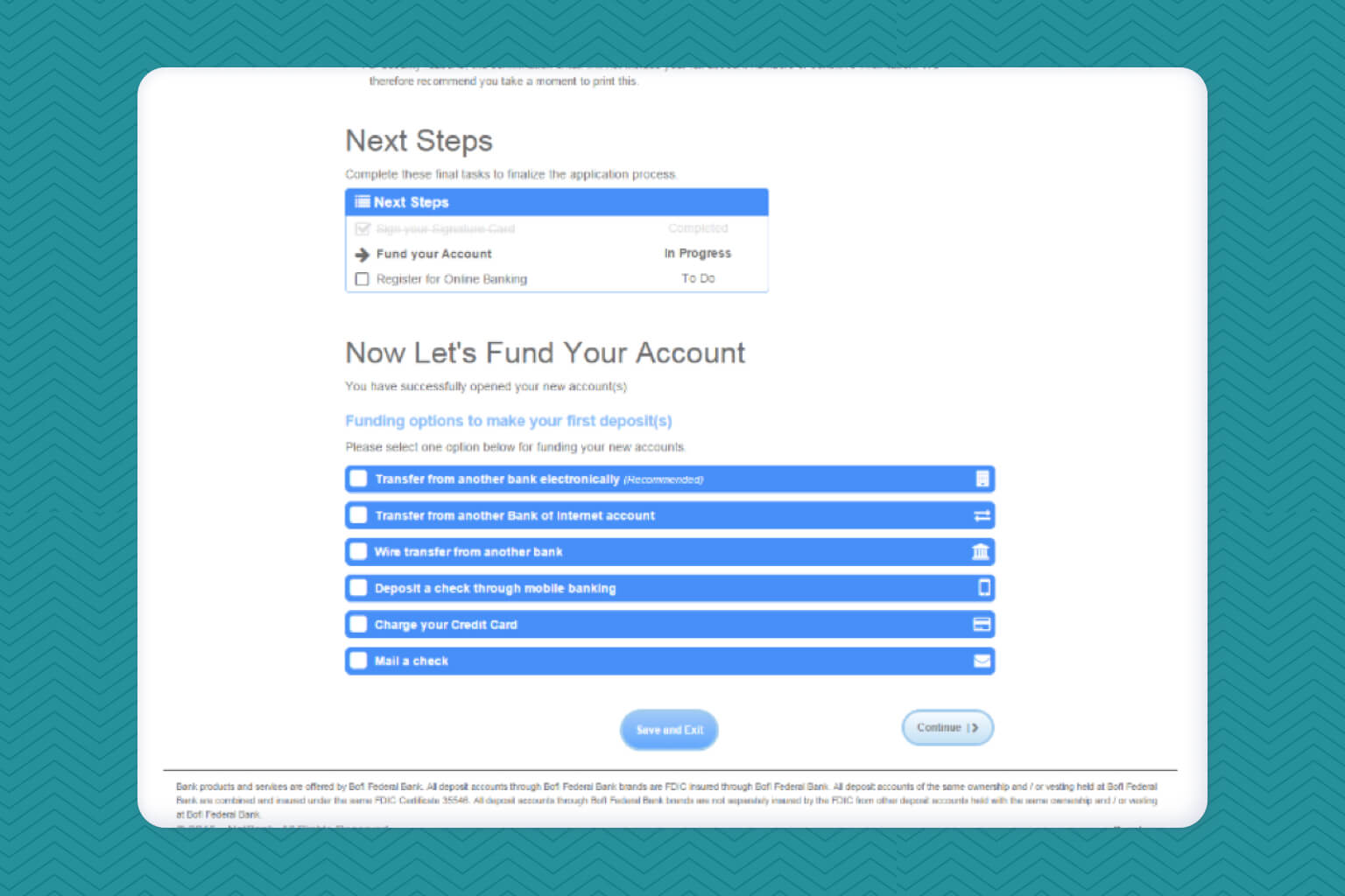
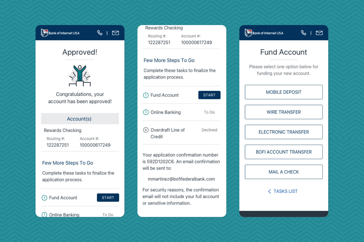
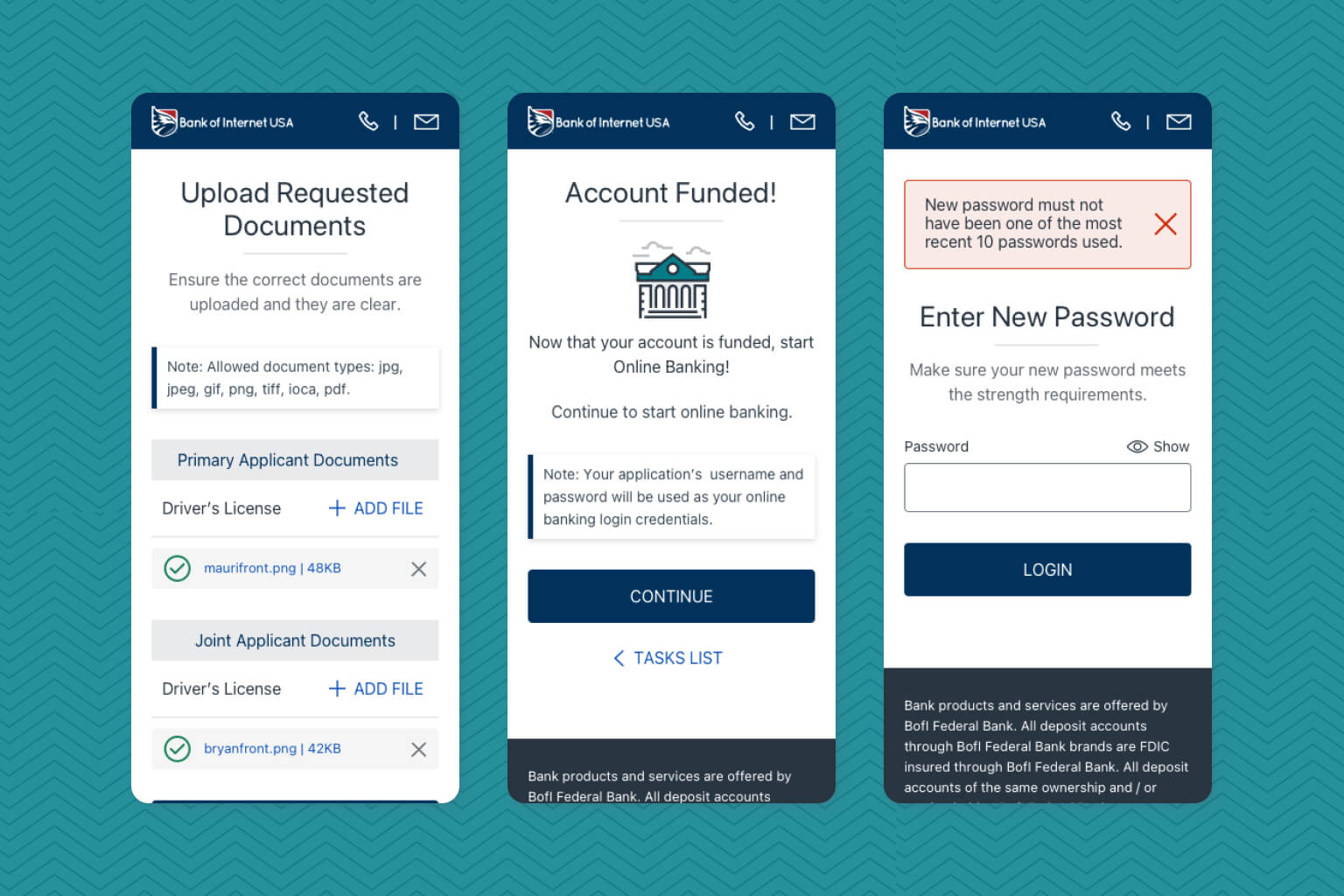
Approved Page Redesign
The approved page received a major revamp. The page was separated into two pages: one focusing on account information and a task list component while the other on funding options available. This made the page easier to digest and helped the applicant understand the progression of their experience.
Feature: Updating The Brand
Focus: Update UI brand elements to match the current BofI USA style.
Using a pre-existing style guide from a separate brand owned by BofI, Bank X, I created a basic design system for developers that included buttons, input fields, typography, and iconography with the proper theme colors of BofI USA.
For context, it is important to note that Bank X was part of an earlier initiative that included launching the Universal Digital Bank platform, an internally built online banking platform. With the intention of future consistency, the design elements from here were used as part of the design system created.
Overall Challenges
Feedback & Iterations
For this project, validation was probably the most strenuous step for me. Design revisions happened almost daily for the happy path flow of the application process. I had to make sure major action items were completed to keep iterating with stakeholders and move the project along. Meeting with the business analyst and my design manager after each review session allowed me to make sure we were on the same page. These meetings also reassured that I did not miss anything important as I had to present most pages and call out the design updates from previous sessions.
Making Sure All Pages Were Redesign
A lot of pages had to be accounted for with this redesign. The consumer enrollment platform consists of various decisions pages triggered by multiple rules in the backend system. In addition, I had to consider other additional use cases for other account types such as joint, teen, and minor scenarios. A spreadsheet was used to track all these pages and the development team supported me by doing their own investigation by looking through the enrollment platform URLs.
Delivery
Learning and Providing a Helping Hand
Developer Hand-Off
After meeting with developers to review the updated workflow and final designs, I handed-off the creative assets. Final architectural sessions were also set up by the business analyst with tech leads to review how the platform will be impacted and figure out the best way of approaching the updates. I did not have to be in these meetings, but I thought it would be good to learn how my design was going to be implemented as well as used this opportunity to meet the tech leads and get acquainted.
Reviewing platform before launch
As the project came closer to launching, I took the initiative to review the platform and make a document of UI issues and bugs that I was seeing. I had seen some issues throughout demos so I asked for access to a lower environment. I was able to take screenshots and give a priority from a designer standpoint as well as the complexity to fix it. When I presented it to the business analyst, we were able to organize items and even though not all feedback was going to be implemented before launch, we made sure that we capture all the large UI issues.
Submission Impact
After a week of its release, data show a decreased in time to submit an application. Median submission time went down from 15 minutes to about 11 minutes. In addition, the percentage of those that completed the application in under 10 minutes went from 30% to 40%, a 33% improvement. Stakeholders were also happy with the updated interface as there was more consistency with the marketing site.
After Delivery
Reviewing Platform
The job was done right? Well, not necessarily. Due to the speed the project was moving and needed to go out by, some of my QA feedback was not implemented prior to the initial release. Most of the issues with spacing and wrong use of font sizes in some places. So my role after delivery focused on reviewing fixes and approving them.
Pushing Platform Updates To Other BofI Brands
Since other BofI bank brands used the same old enrollment platform, there were a few initiatives to apply the new workflow updates and create a theme for each. I ended up created a few style guides for each, listing the necessary typography, colors, buttons, and input fields guidelines. As the changes were apply to each brand, similar results were seen.
Conclusion
Takeaways
Team Collaboration Importance
Collaboration with teams was extremely important for this project, specially because of the fast-paced of iterations due to the delivery date. This gave the project a sense of "all hands on board" to meet the deadline, so everyone made sure the project was moving along through the next phase in the project cycle.
Keeping Things Simple
Early on my design manager told me to keep simplicity in mind and when in doubt, take a step back and think if we are making the process simple enough to avoid asking for help. With the KISS methodology, it really helped me prioritize the complexity between pages to strive for a process that is easy to understand for users.
Prioritizing Feedback
This takeaway connects with the first point about collaboration. Stakeholders gave a lot of feedback through each iteration of the design and with the help of the business analyst and my design manager, we were able to regroup after these feedback sessions to review our notes. We prioritized feedback and broke it down on the actual need and not the solution. As this was my first major project delivered for BofI, realizing the importance of knowing how to prioritize feedback became an important lesson in my development.
