Banking Application Redesign
Optimizing the user experience for new customers opening a personal bank account through a branded mobile-focus redesign, leading to a 33% increase in applications submitted in under 10 minutes.
Lead UX Designer
Web & Mobile
Consumer Banking
3 Months

Overview
Introduction
Bank of Internet (BofI), now Axos Bank, is a digital bank that offers a range of financial products and services for consumers and businesses, including bank accounts, investing accounts, loans, and mortgages. Founded in 1999, Axos Bank is among the first digital banks in the world.
This project aimed to enhance the user experience for customers opening personal bank accounts through a mobile-focused redesign. Because of the narrow deadline to launch, the redesign effort required strong cross-functional team communication that at times, required near-daily updates based on feedback. Lastly, it is important to note that this updated account opening experience served as the foundational enrollment framework for the other brands owned by BofI.
Note:
A more detailed version of this case study is available here.
My Role
I served as the lead UX designer for this project, overseeing the entire design process, including UX analysis, wireframing, visual design, prototyping, and quality assurance. I collaborated closely with a team comprising the Chief Digital Officer, consumer banking stakeholders, a business analyst, and engineers.
The Problem
How might we improve the account opening experience for consumers coming through mobile devices to increase application submissions?
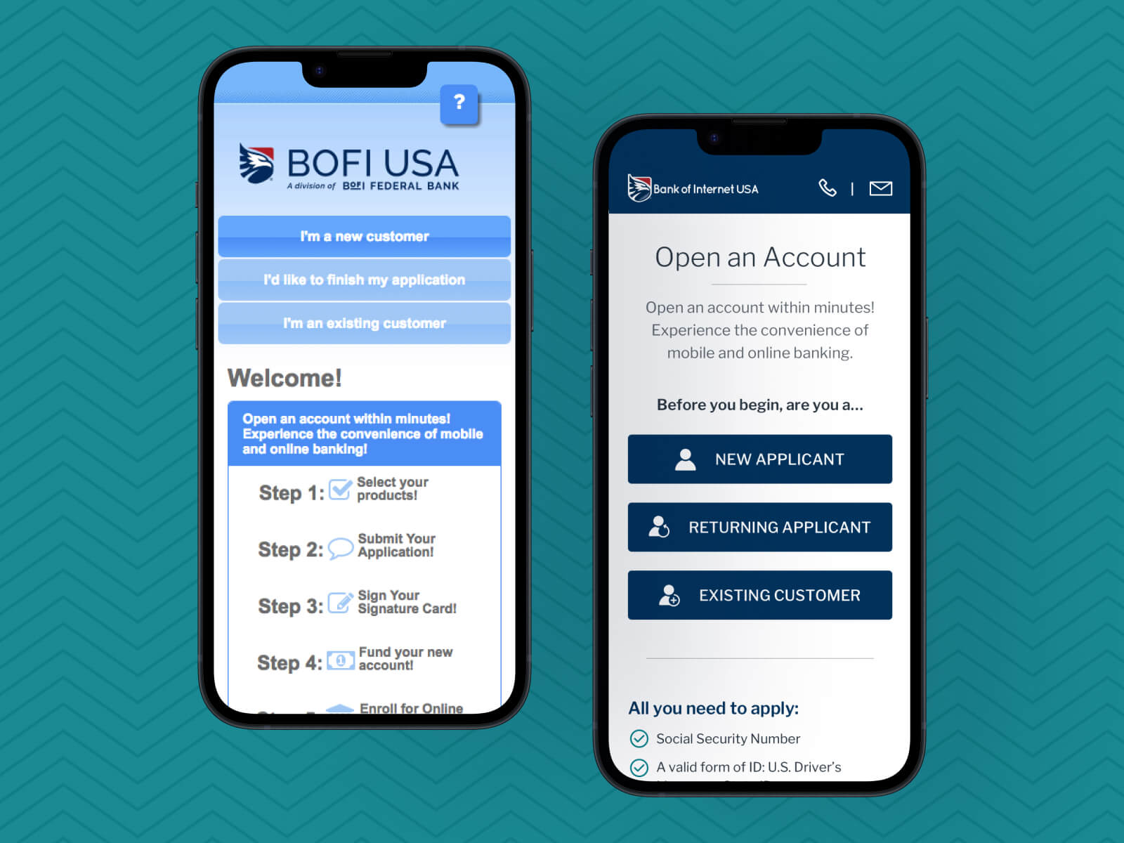
Despite the existing responsive design, the account opening experience lacked brand consistency and optimization for mobile devices. Approximately 52% of users accessed the platform via mobile devices or tablets, with a visible upward trend in the last year of web data. This prompted the need for a more mobile-friendly and brand-consistent design, becoming a top priority for the Consumer Banking department.
The Solution
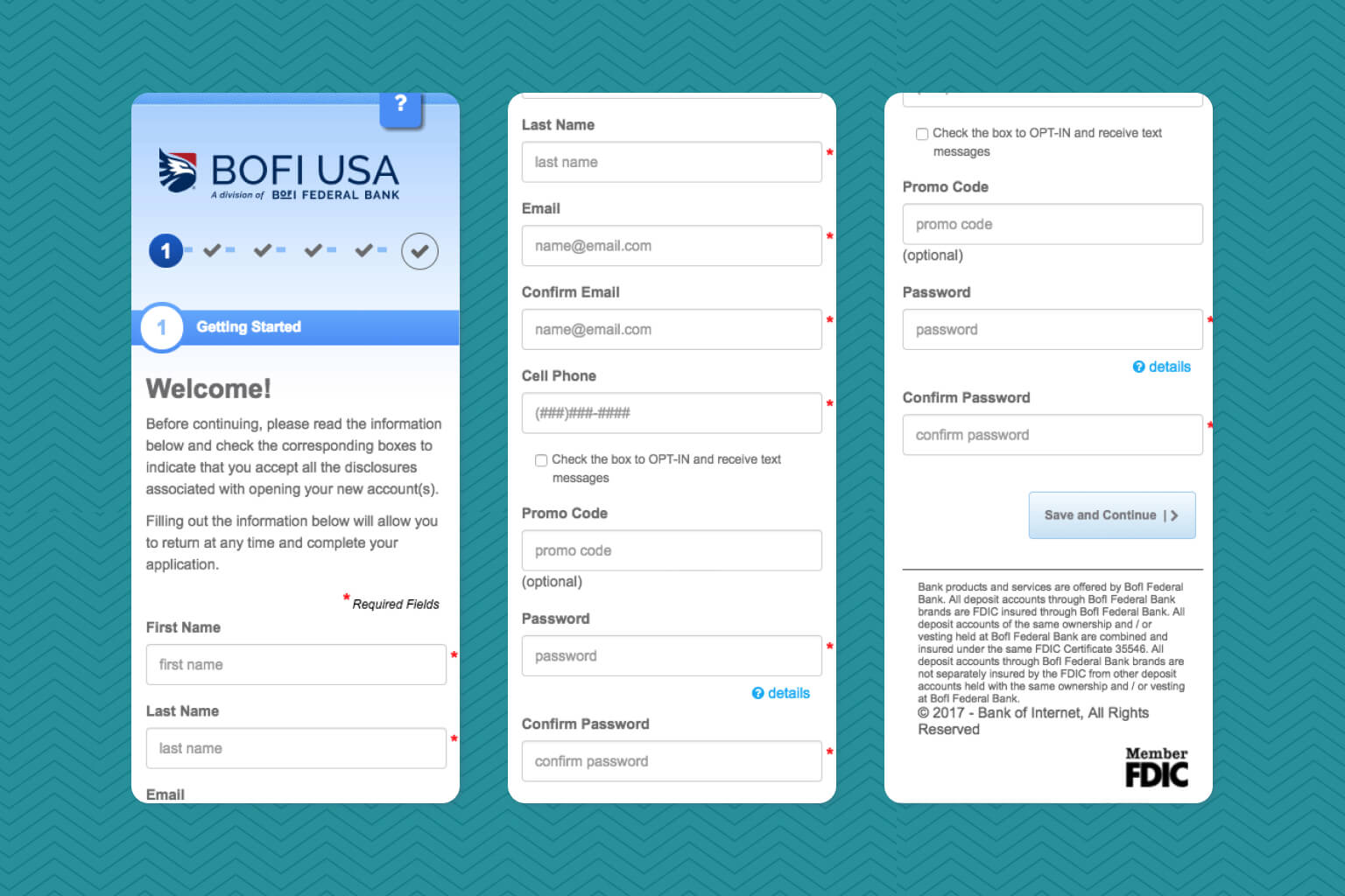
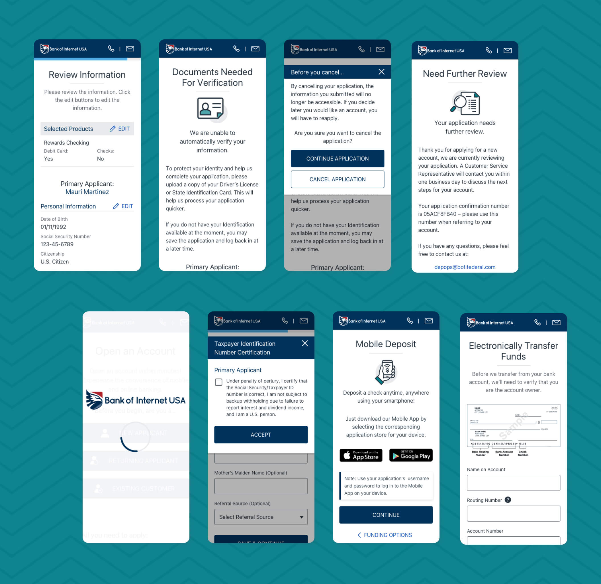
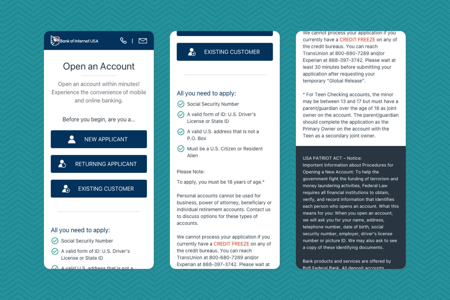
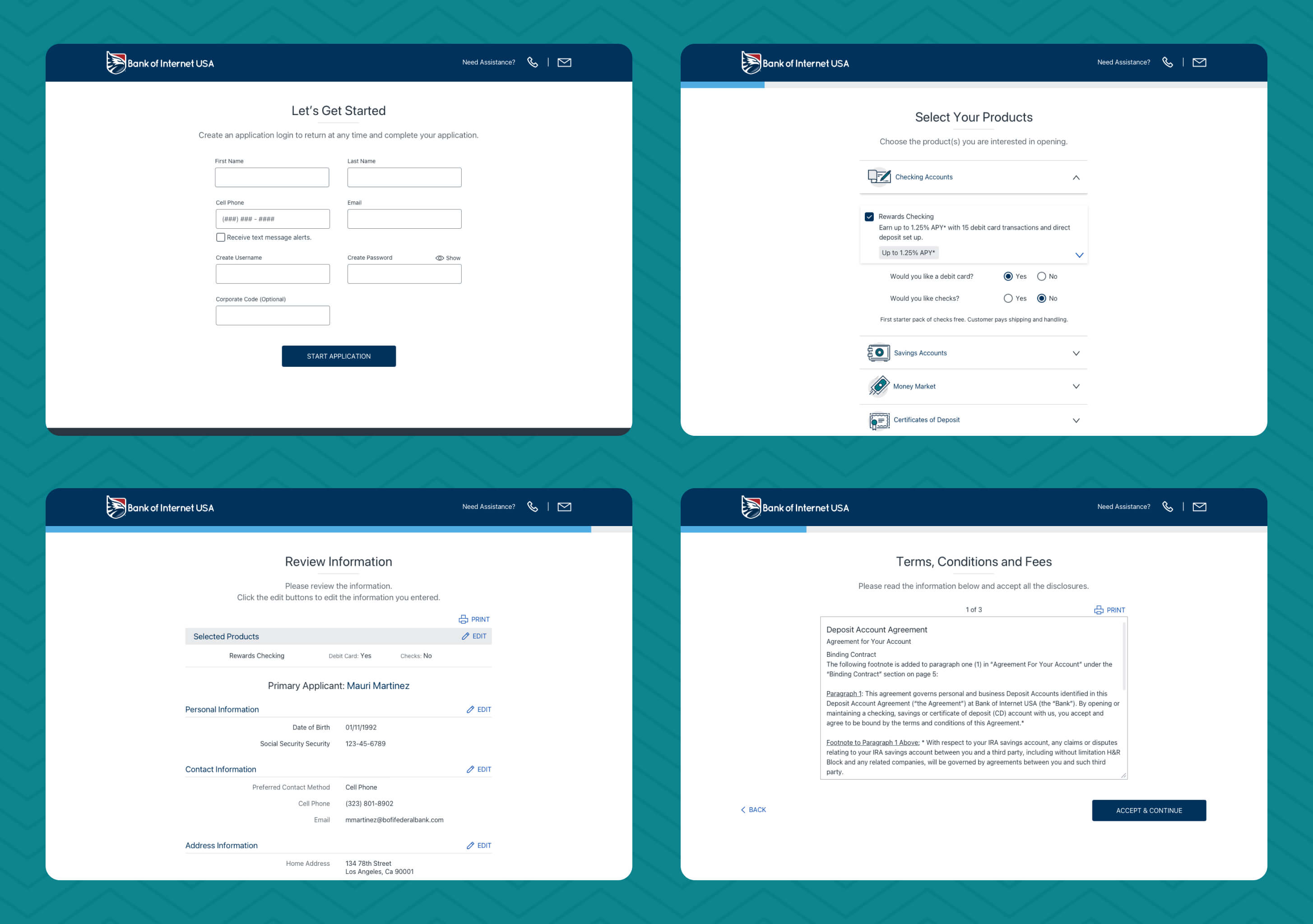
The solution focused on enhancing the account opening process by simplifying every step. The application form was restructured, dividing it into smaller, manageable sections to reduce cognitive load. The product selection page underwent a significant overhaul, eliminating unnecessary elements and creating a more intuitive layout for users to choose their desired account.
Additionally, the UI design was updated to match the BofI USA brand guidelines, ensuring a consistent and visually appealing experience for users. These changes collectively created a more user-friendly and simplified application process, enhancing the overall experience for applicants.
Results & Impact
Submission Time Improvement
The median submission time decreased from 15 minutes to 11 minutes, enhancing overall user efficiency.
Increased User Engagement
A 33% increase was observed in users completing applications in under 10 minutes, indicating a significant improvement in user engagement and conversion rates.
Brand Unification
Brand consistency was created across the marketing site, the online banking platform, and now the consumer application process, leading to a synthesized experience for thousands of new and existing users.
Design
Features
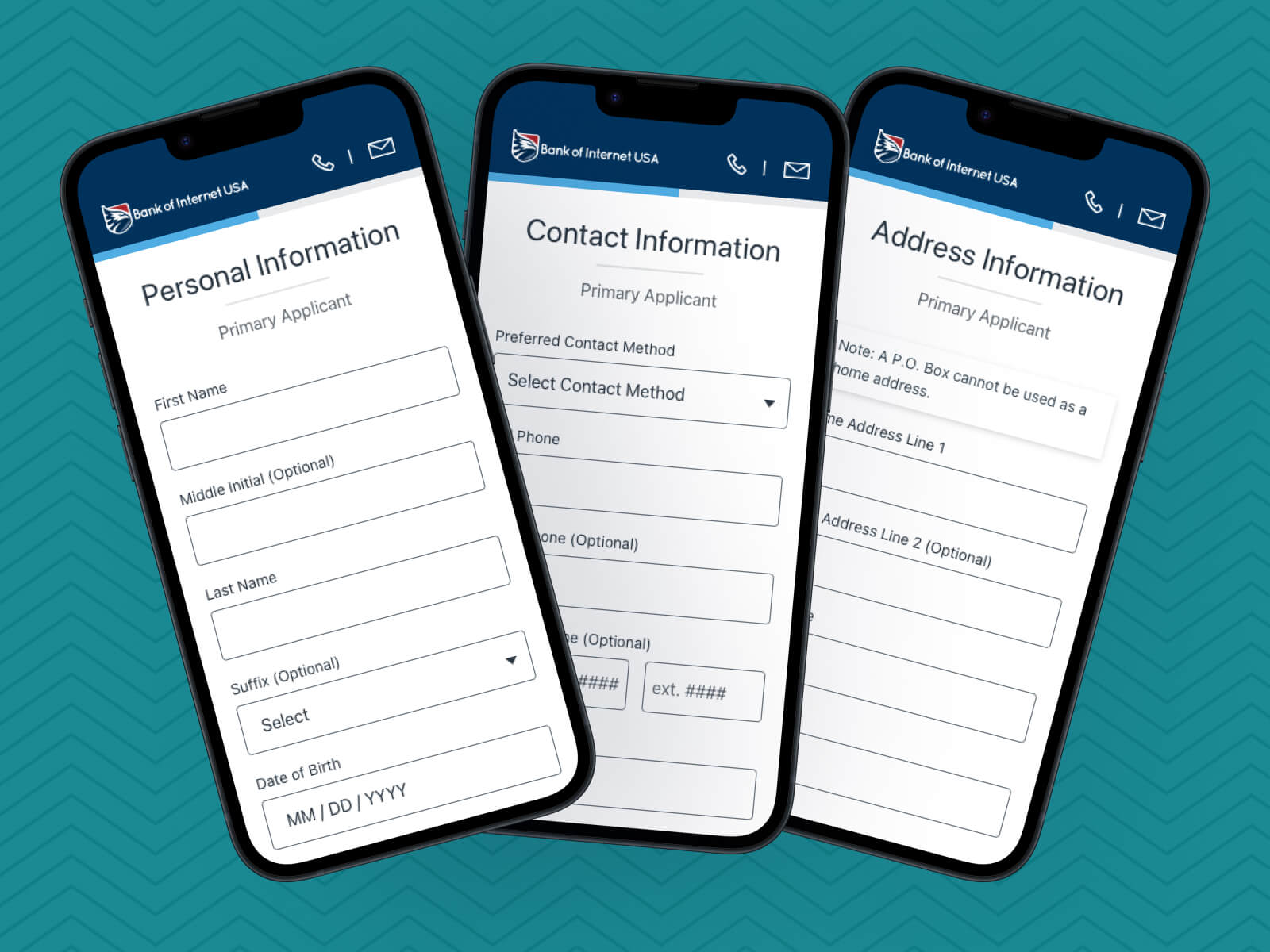
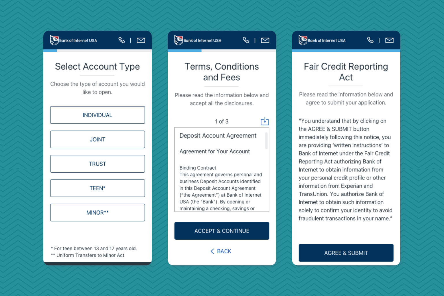
Reducing Cognitive Load (Separation of Pages)
Implemented a step-by-step wizard-like experience by separating input fields into smaller, digestible pages. This approach significantly reduced cognitive load and encouraged users to focus on smaller tasks, enhancing the perception of faster progress.
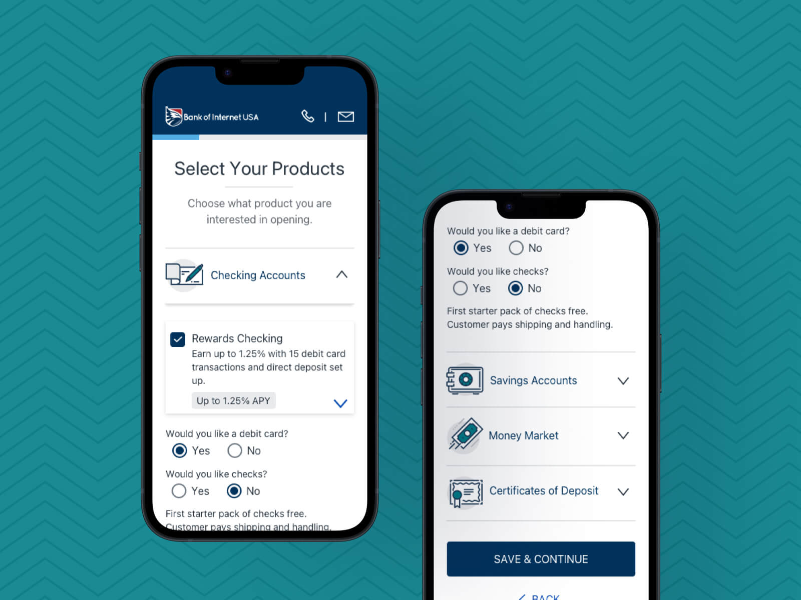
Reorganizing Product Selection
Restructured the product selection page, categorizing accounts (checking, savings, etc.) and allowing users to view individual account options within each category. This organized approach streamlined the selection process and minimized visual noise.
Creating an Up-to-Date Brand Design
Developed a comprehensive design system based on the BofI USA style guide, ensuring consistency across all UI elements. This involved updating buttons, input fields, typography, and iconography, aligning them with the latest brand standards.
Design Principles
Be Mobile Friendly
Prioritized a truly mobile-friendly experience, ensuring seamless application submission from various mobile devices, not just responsiveness.
Be Intuitive
Focused on creating a simple and straightforward process, removing unnecessary elements and complexities that might confuse users.
Be Brand Consistent
Aligned the design with the current BofI USA brand guidelines, ensuring a visually consistent and cohesive user experience.
Design Process Highlights
Strategic Vision
I initiated an extensive workflow and use case analysis to understand the existing account opening process thoroughly. This involved collaboration with the business analyst to break down requirements into design features.
Thorough Competitor Analysis
To understand industry trends and user expectations, I conducted a thorough analysis of competitors' application processes. This research provided valuable insights into design patterns and best practices. By aligning to successful industry standards, I strived for a redesign that met user expectations and offered a competitive edge within the banking industry.
Feedback & Iterations
At one point, near-daily design revisions were crucial, facilitated by continuous feedback sessions with stakeholders. Collaboration with the business analyst and my design manager ensured alignment with project objectives, leading to the desired user experience for applicants. Initiated interactions with engineers to develop trust and strong partnerships during quality assurance reviews.
Comprehensive Redesign
In-depth review was applied to every page of the consumer enrollment platform, including application decision pages and funding method options. Various use cases, including joint, teen, and minor account scenarios, were considered, ensuring a comprehensive redesign of all user flows and application decisions.
Conclusion
Next Steps
Expanding the Redesign to Other BofI Brands
Extending the redesigned workflow and branding guidelines to other BofI brands, ensuring a unified user experience across the organization’s enrollment platforms.
Reflection
Team Collaboration Importance
Collaborative efforts in a fast-paced environment are extremely significant, as this is important to move the project smoothly through each phase.
Keeping Things Simple
Prioritizing simplicity to allow users to navigate the process without confusion was vital in this project. Early on my design manager told me to keep simplicity in mind and when in doubt, take a step back and think if we are making the process simple enough to avoid asking for help.
Prioritizing Feedback
Acknowledging the importance of prioritizing stakeholder feedback was key. Stakeholders gave a lot of feedback through each iteration of the design so it was essential to take a step back and focus on the actual needs over the solutions to bring us closer to the final designs.
Other Projects

Banking Data Dashboard

Online Loan Checkout

